Thursday 30 October 2014

BRIEF ONE - NATURA - LAYOUTS

After defining all of the relevant design decisions I was in a position to start developing the basic layouts for all of the individual aspects of the outcome.

A range of different compositions will be created and then refined to form the final selection of layouts that will be used when digitally developing the individual outcomes. 


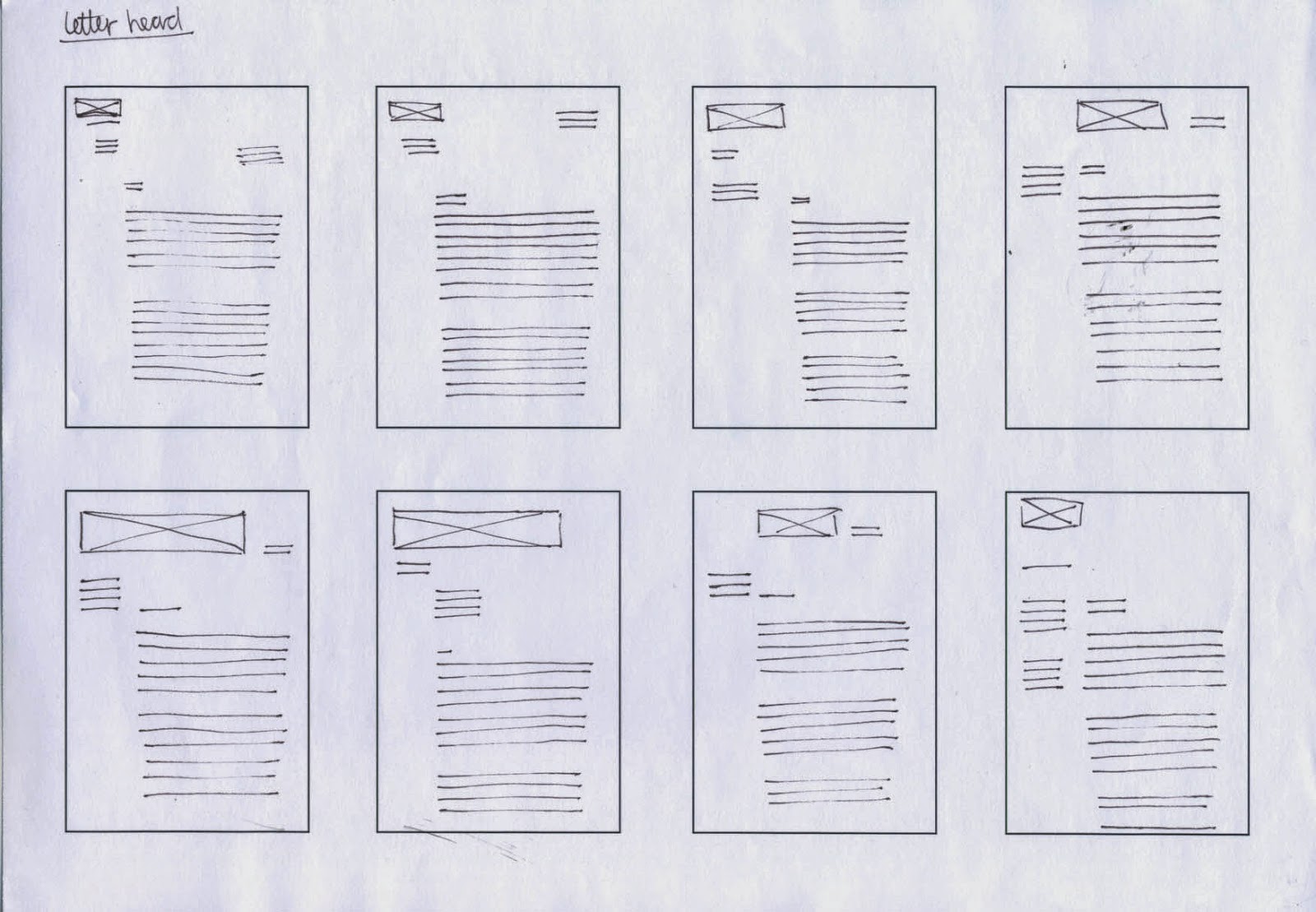
LETETR HEAD & INVOICE 

As the letterhead and invoice are similar documents I decided to create a single layout that can be used to compose both outcomes. Not only does this decision save time, it also helps to form visual consistency across the range of outcomes. 
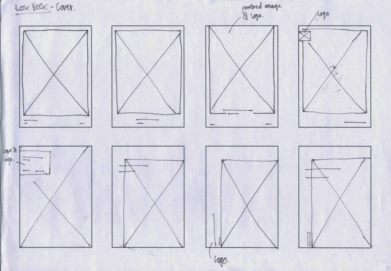
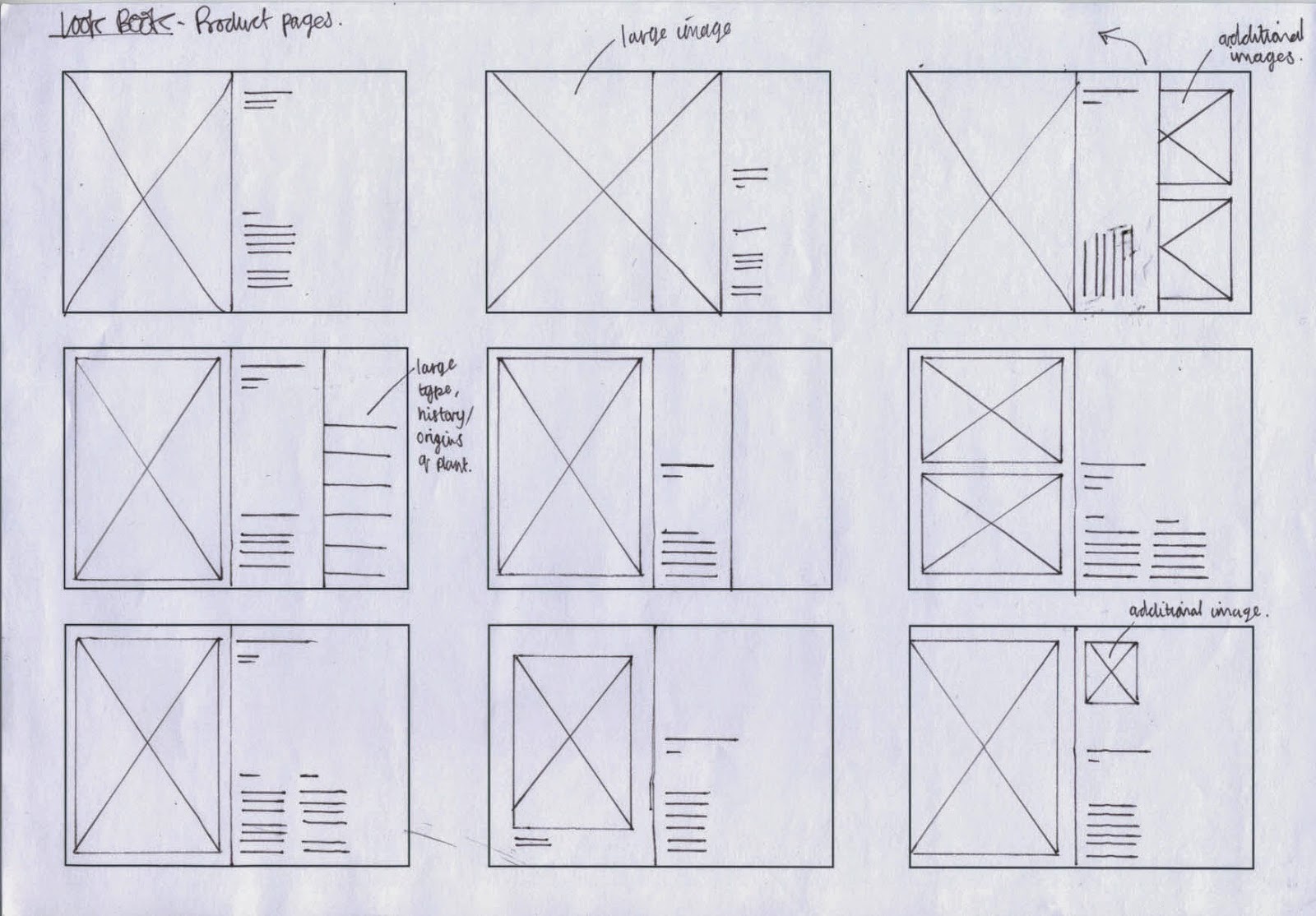
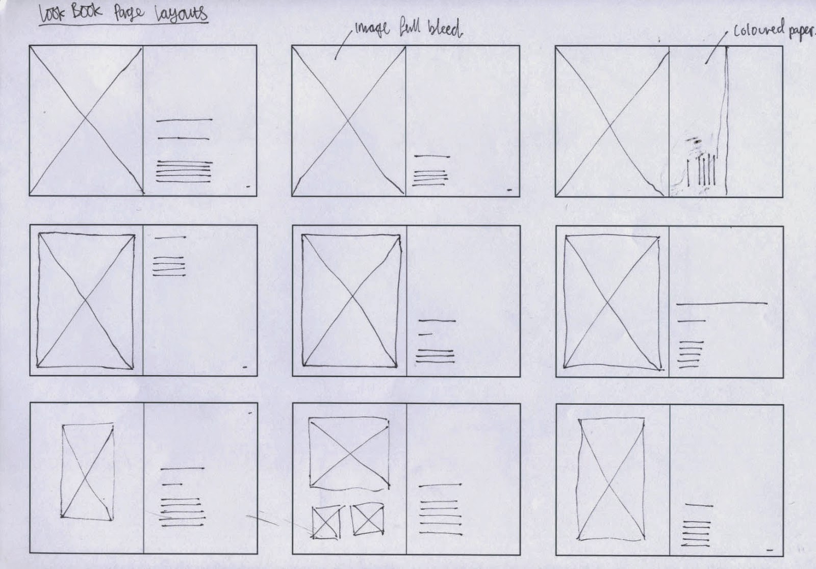


LOOK BOOK

COVER


INTRODUCTION


PRODUCT PAGES


FINAL LAYOUTS 

After developing a range of compositions for the individual project elements I progressed with the brief by refining the initial selection to a choice of final layouts, all of which will be used when digitally developing the various project elements.  


LETTERHEAD & INVOICE - A4


LOOKBOOK COVER - A5


LOOKBOOK INTRODUCTION - A4 (Landscape)


LOOKBOOK PRODUCT PAGES - A4 (Landscape)


Tuesday 28 October 2014

BRIEF EIGHT - DESIGN PUBLICATION - GONZO RESEARCH

After feeling that I misunderstood the task and developed a methodology that was too vague I decided to start researching into existing methodologies published by graphic designers, studios and agencies. 

While reviewing information on the topic I was inspired to look into the varying research techniques used by creatives within the industry. As I was reviewing the different research methods I came across an article that discussed a style of collecting information called 'Gonzo Research'. 

During the Ditto session with Ben I listed Gonzo Journalism as a research method relevant to my practice and listed it on my personal spider diagram. I was inspired by Gonzo Research after reading about Hunter S Thompson, a journalist who emerged himself within the culture that he was writing about, living like they do to get the truest and most unbiased view of the subject.

Personally, I think that gonzo research is a extremely effective method of collecting information as it allows you to compile relevant research in an unconventional way that allows you to generate innovate insights and directions.


The article discussing gonzo research is featured below;


CONCLUSION 

Personally, I find the idea behind gonzo research very appealing as it allows users to generate information from primary sources and simultaneously draw innovative conclusions from the generated information. The methods applied to collect information are engaging, and allow users to experience the culture first hand. As a designer, I have previously predominantly relied on secondary information when researching for projects. I plan to move away from this mundane way of researching and start using gonzo methods to collect my data. 

BRIEF EIGHT - DESIGN PUBLICATION - WORKSHOP ONE

Ditto


Today, Ben Freeman, co-founder of Ditto press in East London came into university, gave a short, informative presentation and delivered the days research based workshop.

Notes taken during the talk;


In the presentation Ben introduced the specifics of the company and talked about the types of work they are responsible for creating. An interesting aspect of the company that appealed to my personal interests is the companies use of risograph printers, which are used to produce work whenever the method is applicable. As a designer risograph printing is a very appealing production method as it creates tactile, interesting outcomes and allows printers to use vegetable based ink helping the process to be more sustainable.  

As a company Ditto Press are responsible for creating a range of different print based outcomes from posters to stationary. However, around 80% of their client based work comes from people wanting to print books and zines. During the talk Ben showed some examples of the books and zines that the company have produced, one project that stood out due to its comical content was 'Frozen Chicken Train Wreck' by Laurence Hamburger. 


Product Image


RESEARCH METHODOLOGY WORKSHOP

At the end of the presentation we were each given a brief detailing the specifics of the task and were divided into small groups of around 12 people. 


THE BRIEF;


BRIEF SUMMARY;

Although I felt I initially understood the task, after discussing the details with other members of the group I soon discovered that I was confused as to specifically what we were tasked with doing. 

It was soon explained that the task for the day asked us to develop our own personal research methodology that can be utilised when starting future briefs and projects. The aim of creating the methodology was to help us challenge the conventional ways of collecting information commonly used by members of the course. The methodology that we develop should reflect our interests and passions as people allowing us to collect informed information in innovative ways that engage us as learners. 


DEVELOPMENT 

I started the process of developing my personal research methodology by first documenting as many approaches of collecting data and information as I could think of. Next, I reviewed the methods listed and started thinking about how they relate to my design process and personal interests. 


Relevant/Interesting research methods;

  • Observations - insights and opinions gained from observations. 
  • Case study - primary images, personal notes & observations - like a report.  
  • Investigative research - Gonzo research, immerse yourself in the culture.
  • NOTE - The above three points are almost identical. 
  • Primary body of photographs. 
  • Visual research - collected print ephemera, relevant visuals etc. 


After creating a list of research methods I was ready to start developing my personal research methodology. 

Ben mentioned that the methods we develop should form an approach to research that will be applicable to most of the future projects that we receive. Taking this into consideration, I decided to create a fairly open methodology that utilises vague terminology to ensure it is applicable to the varying contents of design briefs.

As a designer I find that a balance of visual and content based information is the most useful when developing from the research to development stages of a project. Therefore, when creating the diagram I tried to develop a balance between both visual and content based research methods.


When creating the methodology I considered the research process commonly used to ensure informed and relevant information is collected. The process relies on analysing the brief to ensure you understand what is being asked and using secondary research to form a basic understanding of the topic. It is important to generate this basic understanding before progressing to use primary research methods as without it you lack the basic knowledge often needed to collect relevant information.

As I used vague terms I decided to break down the individual parts of my methodology to evidence how the creative approaches of collecting information can be found under each section;


CRITIQUE

After lunch each group had a critique with Ben where we were given the chance to talk through our chosen research methodology. After, we were given feedback as to how relevant and applicable the chosen methods were.

During the critique I discovered that I may have slightly misunderstood the task or not communicated my idea efficiently enough. 

The vague methodology I created had an almost identical approach to the standard academic way of collecting research, and this is not what was wanted from the workshop. Instead, I should have listed the innovative ways of collecting research that have relevance to my design practice. 


After presenting Ben gave useful feedback to each person; 

Critique Feedback;
  • Research methodology presented uses a very academic approach. 
  • Consider what methods have most relevance, drop the ones that don't - refine.
  • What innovative research approaches have relevance to me?
  • What research methods do I find most enjoyable? 


CONCLUSION 

Firstly, I found today's session really useful and inspiring. Learning about creative approaches to collecting information made me realise that I really need to develop my current approach to researching. Previously, I have predominantly relied on secondary sourced information coming from books and the internet, although this is useful for getting an informed understanding of the topic, regurgitating information is probably one of the most unengaging ways of collecting information and data. Having become inspired today I plan to progress by creating a much more practically driven research methodology that allows me to collect relevant primary information in an creatively engaging way. 


Monday 27 October 2014

BRIEF ONE - NATURA - CONCEPT

The basic concept for the Natura brand identity project is based around engaging the young, lifestyle focused audience with simple, honest communication supported with a range of colourful engaging visuals.  

Through the initial project research, it was defined that there is currently a huge gap in the market left by the companies currently involved with the sale and distribution of house plants. At the present time, most companies are involved with selling both indoor and outdoor plants and yet do little to market either to their prospective target audiences. To exploit the lack of visual engagement inherent to Natura's competitors, the design solution will focus on showcasing the products and creating a friendly, approachable brand that focuses on simple, straight to the point communication.

As a reference to the 1970's, an era when houseplants last boomed in popularity within the UK, visual elements will be taken and adapted from secondary research reviewing the colourful interiors of the homes in which the plants were situated. To ensure the companies brand identity still appeals to the modern audeince outlined on the brief, 70's inspired aesthetic elements will be balanced alongside a refined, modern aesthetic that creates an intriguing and approachable brand.  

BRIEF ONE - NATURA - PHOTOGRAPHY BRIEF

A definitive part of the project will be the set of images featuring the house plant and cacti products sold by the company. 

As part of my visual research I found a set of images that featured plants that had been photographed on coloured paper backgrounds. As defined in the design decisions post, I want the chosen photographer to utilise a similar technique when shooting the product images for my project. Plants and cacti will be photographed on a range of coloured backgrounds which will be specifically selected to reflect the range of 1970's inspired colours defined for the project colour scheme. 

As the images will form one of the main visual aspects for the branding it is imperative that the images are taken in a professional manner and meet my desired restrictions. Consequently, if the images do not achieve the desired quality the success of the whole project could be affected. 

I quite a specific idea of how I would like the images to look, and so to help me communicate this to the photographer I decided to write a brief. 


THE BRIEF 


After writing and reviewing the brief I sent it to the third year member of photography who previously agreed to help me photograph the plants and cacti.  


BRIEF ONE - NATURA - GROUP CRITIQUE

After today's briefing we were allocated groups and a two hour time slot so we could arrange some critiques to review our current progress with the extended practice module.

The groups were relatively small and so we allocated a ten minute time slot for each person in which they would present their work, pose questions and receive feedback. 

As I have been concentrating predominantly on my COP research and development I have only made a proper start on one brief, the house plant company branding, and so this is the project I chose to focus on during the critique. 

In preparation for the critique I made a power point presentation that summarised the brief and gave context to my current progression, this allowed me to receive informed feedback from the rest of the group as they understood why certain project decisions have been made. 


PRESENTATION 


  • Research focused on 1970's interiors after my tutorial with Danny.


  • Colour scheme derived from 1970's aesthetic research.


  • Initial logo icon developed from sketches. 


  • Icon development. 


  • Balancing with typographic element. 


  • Current choice for the logo/icon combination. 


FEEDBACK 

After I finished presenting I recieved verbak feedback which I made note of in my sketchbook;

  • Capital letters inconsistent on logo/icon combination - develop and make more consistent.
  • Advertisements produced could have an informal approach and use puns to appeal to the outlined audience.  
  • Shop location - Consider broadening the range of the branding, a shop location could also be considered as an aspect of the project.
  • Additionally, an internet based shop could also be considered. Shopping on the internet is easy and simple similar to the identity and nature of the products sold. 
  • Plant packaging - how will the products be packaged? 
  • Re-think the timescale of the project, this could be extended so the additional outcomes could be produced as part of the submission. 


CONCLUSION 

Firstly, I found today's critique really useful as it allowed me to present my current progression with the project and receive some relevant and applicable feedback. 

In preparation for the project I created a simple power point presentation in which I first introduced the brief, its timescale, the background and target audience. By talking through the specifics of the project I was able to give context to my current progression with the brief and subsequently evidence why I have made the choices and design decisions I have. Additionally, by informing the group of the project specifics allowed them to give focused and relevant feedback as they understood the context behind my design decisions and project direction. 

To help me progress from the critique I reviewed and analysed the feedback I received and outlined points that I will use to help my project develop;
  • Refine logo - make the characters on the type/icon combination logo consistent.
  • Rethink project timescale - Extend the deadline and consider additional outcomes such as a shop location, product packaging and internet campaign.  


Saturday 25 October 2014

BRIEF ONE - NATURA - VISUAL RESEARCH - WOLFGANG TILLMAN

Another research direction that was suggested in my personal  tutorial with Danny was to review Wolfgang Tillman's book cover series for 'Philosophy in Transit'. During my tutorial I described the kind of aesthetic I wanted to create for the poster series that will be produced as part of the final outcome. 

After listening to my explanation Danny suggested looking at the book cover series as they employed a similar simple aesthetic and could be used as inspiration. 


PHILOSOPHY IN TRANSIT 


Relevance;
  • Typeface hierarchy helps to focus the viewers attention on the title of the publication first followed by the subsidiary information such as the author and series title. The hierarchy is established through the varying size of the typography displayed.
  • The covers use a simple composition consisting only of an image, type and the publishers logo. 
  • The composition is consistent across all of the covers - this is something I could utilise when creating my posters.  
  • The cover is simple and straight to the point, what you see is what you get, and this has been cleverly communicated through the limited use of relevant visuals - Aesthetic relevant to the type of outcome I want to achieve. 
  • The image covers the bottom two thirds of the composition and therefore forms the most attention grabbing aesthetic element, this is important as the image is also used as a visual representation for the books contents.