Friday 30 January 2015

BRIEF EIGHT - DESIGN PUBLICATION - NOTEBOOK PRODUCTION

Images below document the step by step process of creating the sustainable notebooks, from trimming the collected paper to binding the individual booklets. 

During our last session with Ben, I presented the idea that I wanted to move back to working in notebooks as this is an aspect of my practice I lost when I came to university. I feel working in sketchbooks has many benefits to my developing practice, some of which have been listed below;

  • Get back to working with my hands - Sketching is something I don't spend a lot of time on since starting the course and using a sketchbook to record research will help me integrate it more into my practice. 
    • As a designer whose practice is largely influenced by hand rendered development, sketching more regularly will help my practice to develop. 
  • Portable, allows me to collect and record research easily while on the move.
  • Less restrictive than blogging - pages can be scanned with important aspects highlighted within the blog post. 
  • Working in a sustainable notebook has relevance to my ethics & manifesto. 

Although the notebooks were mainly developed as part of my PPP module, I am planning to use one of them as my research sketchbook.


COLLECTED PAPER 

The image below displays the range of waste paper stocks that were collected throughout the first five months on the course. 

The stock, which will form the covers and interior pages of the notebooks, was collected from bins and tables from around the university, and so would have otherwise been sent to be recycled. By collecting and using waste paper stock instead of buying some recycled stock from the internet I am able to vastly reduce the carbon footprint associated with the notebooks.


Stock collected over a four month period. 


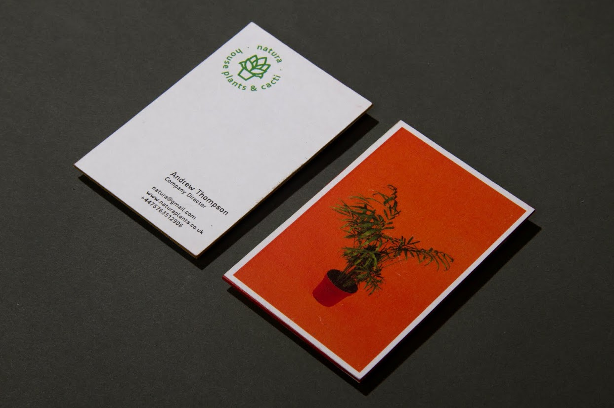
I also collected some recycled grey board for the notebook covers that had previously been used to print business cards. Luckily for me, the board was unused due to a misprint. 


TRIMMING

The stock that was collected came from a range of sources and undoubtedly had been used for a range of purposes. A consequence of using waste paper was the varying sizes of the individual sheets. One of the first major tasks that needed completing as part of the project was the process of trimming all the sheets down to the same size. 

Paper was trimmed using the guillotine. 
As the collected stock came from a range of sources individual sheets varied in size. 

Paper was trimmed to an A4 size so that when folded it met the outlined individual page size of A5.


NOTEBOOK PRODUCTION 

The sheets of trimmed paper were taken back to my house where I completed the various stages of the binding process. 

Tools used during the binding process. 

Folding the paper was very tedious and took over three hours. 
Paper was arranged into piles of stock type, this helped when creating the individual signatures.
The signatures consisted of six folded pages and varied in stock type giving the books a lot of character. 
An etching needle and custom template were used to pierce holes through each signature.  
Each booklet will feature five signatures giving a total of 120 individual pages. 
A singular signature was used to measure the size of the grey board cover. 
The inside face of the grey board used for the covers was lined with a coloured stock to make the notebooks more aesthetically engaging.

A hole punch was used to punch holes into the cover. 
The coptic stitch was completed using hemp string, a stronger and more sustainable alternative to most conventional twines.


FINISHED NOTEBOOKS

After the stitching process was completed the notebooks had any excess trimmed from the pages and covers to ensure that they are neat and finished to a professional standard. 

Once the process of trimming was complete the sustainable notebooks were ready for photographing and sale. Of the seven produced, one was taken to serve the purpose of a research sketchbook with the other six being sold as part of the PPP module. 


Saturday 24 January 2015

BRIEF ELEVEN - YCN - SELECTING A BRIEF

Leading up to the COP3 hand in on Thursday I was working at a high level of productivity to ensure my work was completed to the highest of possible standards ready for the submission. Following the hand in, I wanted to make sure that I sustained the high level of productivity and commitment to work that allowed me to successfully submit my COP module at a standard I was really happy with. Therefore, after celebrating the hand in, I decided to read through and analyse the available YCN briefs, a process which consequently allowed me to select a relevant and engaging brief I want to progress with.  


THE BRIEFS 

On the YCN website there was a selection of different briefs representing a range of clients available for participants engage with, some are small businesses and initiatives while others are larger and more corporate based. 

As a graphic designer a founding aspect of my design practice is my ethically focussed manifesto, something which always plays a big part when selecting live briefs to engage with. It would be hugely contradictory of me to espouse such ethical views and then undertake a brief for a large, unethical corporate client. Therefore, when reviewing the briefs available I assessed the company as well as the brief to ensure their values don't contradict mine. 

While reading through each brief I got an immediate idea of whether or not I wanted to engage with the particular project, either because of the company it was for or because of the specifics of what was being asked. Therefore, while working through the YCN website I was able to quickly outline three main briefs I wanted to engage with.

To help me make the final decision of what brief to work on I decided to analyse each brief to define the specifics of what is being asked. 


IMPORTANT POINTS - 
  • Band information - Moo is an online print and design company - provide businesses with business cards, promotional material etc.
  • Working towards providing both printed and digital media.
  • Brand characteristics - Playful, open, encouraging, social, helpful.
  • Target Audience - All sizes of business from all industries (needs refining).
  • Challenge -  Raise awareness of Moo's philosophy 'Design Works Wonders' and create a visual representation of the importance and effectiveness of design - No restrictions to format or media.
  • Extra Information - Responses should; promote the importance & effectiveness of design in business, look striking and visually engaging, get customers excited about the company, make people smile, get people to visit the website.
  • Relevance - Open with media used - presents me with the opportunity to be creative with my response. Creating for issue I am passionate about - the importance of design. 


IMPORTANT POINTS -
  • Band information - Macmillan Children's books is a division of Pan Macmillan, one of the UK's leading publishers. 2015 marks the 150th anniversary of the publication of Alice in Wonderland, on of the most important books Macmillan have ever published. 
  • Target Audience - Primary audience consists of parents of girls aged 5-9 and parents of boys 5-9. A secondary audience consists of gift givers, such as aunties and uncles. 
  • Challenge - Create a new cover and up to two interior page illustrations for the Alice in Wonderland publication. Open to all styles of illustration. Response should re-imagine Alice while retaining the aesthetic attributes that form her iconic image.  
  • Extra Information - Illustrations should capture the interest of a new generation of readers. We are free to choose the interior pages we illustrate. Cover design must include Macmillan logo. 
  • Relevance - Brief presents me with the chance to engage with the illustrative aspect of my practice. Workload not too heavy - relevant at this point in the year.   


IMPORTANT POINTS -
  • Band information - Save the children has worked in the UK since the 1920's and has been involved with various campaigns that aimed to improve the wellbeing of children. Now, the charity are based in over 120 countries worldwide and is involved with various schemes aiming to help children reach their full potential. 
  • Target Audience - Dads with children under 11 from low-income families (C2DE socio groups.
  • Challenge - Create a creative resource that will inspire an motivate dads to read to their children for 10 minutes a day. The response should raise awareness of the how much difference just 10minutes a day of reading can make to a child's life and future. 
  • Response Characteristics - Fun, personable, enthusiastic and engaging. 
  • Extra Information - Response should build upon the campaigns lauch momentum. Responses should follow the 'Read On Get On' guidelines and include the save the children logo. 
  • Relevance - Responses created for an ethical cause - has relevance to my ethical philosophies. 


THE CHOSEN BRIEF 


WHY CHOSEN -

Of the three final briefs I outlined from the initial selection on the YCN website I decided to progress with the 'Moo - Design Works Wonders' brief. The reasons for doing so are listed below.

  • Open with media used - presents me with the opportunity to be creative with my response. 
  • Open with media used - allows me to create a response with relevance to the focuses of my design practice. 
  • I am passionate about the message that is being promoted - the importance of design.   
  • Multiple directions the brief could be taken in. 
  • Winning design has the potential to be used as an actual campaign - good industry exposure. 

Tuesday 20 January 2015

BRIEF ONE - NATURA - BRAND GUIDELINES

Finally, after I had finished the various stages involved with the design and production of both the printed and digital outcomes, I finalised the brief by creating brand guidelines for Natura's brand identity. 

In a real life situation, the project would have been produced for a client to whom all of the individual outcomes would be sent to. To ensure that the brand identity retains its visual consistency after the project has been signed over to the client brand guidelines, defining how the individual elements of the identity should be applied, are often created and submitted with the project. 

The brand guidelines I created for Natura's brand identity cover a range of aspects to ensure aesthetic consistency is retained by the brand;

  • Logo variations.
  • Logo sizing.
  • Typography.
  • Colour scheme.
  • Materials. 

NATURA - BRAND GUIDELINES 


BRIEF ONE - NATURA - FINAL IMAGES

Despite finishing the project before christmas I was unable to book a photography studio and arrange to shoot the project before breaking up from university for the christmas holidays. Therefore, one of the first things on my post-christmas to do list (apart from the mountain of COP3 tasks) was to organise the shoot and take some professional quality images of the project for my portfolio. 


BOOKING A STUDIO

After the context of practice hand in I was able to book the large photography studio, a decision which was purposely made to ensure that I had enough room to images of the various aspects of the project.

In a previous shoot, when photographing a similar sized branding project I was unable to shoot high angle images as I booked to shoot on a small studio table and subsequently could not use the right equipment. High angle images are photographs that are taken directly above the subject from a vertical perspective and require a special piece of equipment to take them. Due to the angles that can be achieved when using the technique it is commonly used when photographing branding projects as a way to display all of the project elements in one shot. 


PROJECT ARRANGEMENT ONE 

The first arrangement that was photographed consisted of all the printed media that was produced as part of the branding project. To take the a special piece of photography equipment allowed me to take images vertically above the composition of design elements. 


PROJECT ARRANGEMENT ONE - ALTERNATE ANGLES 

To ensure that the set of images are not too repetitive I also took angled photographs which will be presented alongside the high angle shots.


PROJECT ARRANGEMENT TWO 

The second arrangement focuses just on the letterhead, invoice and envelopes, all elements of the project which would be sent to clients. 


BUSINESS CARDS 

A series of images were taken showing the four business cards, each of which had a different product image and colour coordinated edge painting.


PLANT TAG  


BOOKLET IMAGES 

High angle images were taken of the booklets pages to illustrate page compositions and general flow of the publication. Additionally, as the set of images were taken using fixed tower the images can also double-up and be used to create a moving gif displaying all of the individual pages.  


BOOKLET - ALTERNATE ANGLES 

To ensure the booklet images are not too repetitive I also took angled page images and photographs showing the removable free post  order form. 


POSTERS 

The final images taken display the two poster variations created to promote the new company.